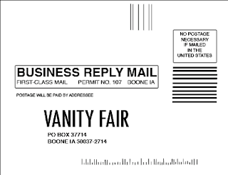


1. Photoshop-Back of Card
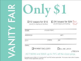
2. Quark-front
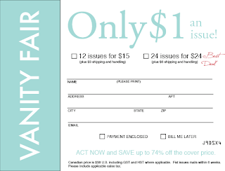
3. InDesign-front
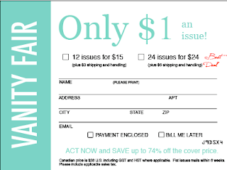
4. Photoshop-front
Design Rationale:
This project was the one that took me the longest to complete, because of its complex nature and attention to detail. I thought that finding the fonts to match each word was difficult for the first card; however, after I found them for the first one, it was easy to choose the same fonts in the other programs.
I found Quark to be rather difficult, because it is not easy to work with text in Quark. I had to create a new color in Quark because there were limited colors available and none of them matched the card. The color I created was C: 49.1%, M: 0%, Y: 31.1%, K: 0%.
InDesign was the program that I found to be the easiest to use. The use of colored layers helped me recognize what layer what text was on and how to manipulate it. The hardest thing to do in all of the programs was to create a box with no fill. Once I learned how to do it, I copied and pasted the box, so that they all would be the same size.
I chose to complete my first Bind in Blow in Photoshop. I found that completing the first card was the hardest part. One problem I encountered was the though the measurements matched up to the 4.3" x 5.625" card, the depiction on the screen was not to scale when held next to the actual card. I found that by viewing the project at 133%, the size matched up perfectly and made it easier to replicate the card.
I chose to replicate the back of the card in Photoshop because I understood how to manipulate the layers and text well in the program. The hardest thing to do was to create the little lines at the bottom of the card. I used the line tool, and realized afterward that it might have been a better idea to use the text tool and the letter "I" or "l" instead, because that way the lines are guaranteed to be straight.
One problem that I found was that not all the programs had the same font. When one program didn't have the font I had used in the previous program, I had to search through the fonts again. Another thing that I had to do in each program was create a new color. The color on the card was a hard one to duplicate, so it took some time to get it right. Still, the color on the 3 versions do not all match up.
If I had to use a program in a professional setting to complete a project of this nature, I would choose to use Photoshop because I feel that it has more options and more ways to manipulate and change material.
No comments:
Post a Comment