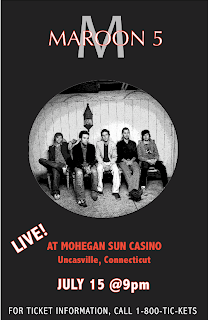
I chose to create a concert poster for the band Maroon 5, because they are one of my favorite bands.
Though I found Quark to be a rather temperamental program, once I found out how to work with the layers, I was able to successfully create my poster. I chose a color scheme of black red and white because those are three colors that are often associated with the band.
My favorite part of my poster is the "Maroon 5" overlapping the big grey "M". This is a symbol associated with the band, and I wanted to create it so that it looked similar to what is on most of their posters and album covers. To create the overlap effect, I had to place "M" and "Maroon 5" in separate layers. I then had to put them in the order that I wanted them to appear to the front. I sent the layer containing "M" to the back, so that the "Maroon 5" was in the foreground.
Another part about my poster that I really liked was the lettering that I used. For the "Maroon 5" I used Optima font at 80 pt, and for the "M" behind it I used "Candara" font at 250 pt. To make the white letters with a red outline, I clicked the "Outline" tool in the text toolbar, then created a red that I liked with the color selection tool. For all other text on the poster, I used "Abadi MT Condensed Light" at different sizes. For emphasis on the location of the concert, I chose to make the lettering bold and a solid red color.
The image I chose to use was an image of all 5 band members. The image was black and white to begin with, which I found particularly cool. I used Photoshop to edit the photo. I gave the photo Poster Images from the Effects gallery, which made it seem as though the band members were radiating light. When I inserted the picture onto my poster in Quark, I chose the oval picture frame, because I thought it made the poster look really cool.
One thing that I found difficult with Quark was spacing. I found that under the "View" menu, I can select to view my poster with guides, and I can create my own spacing guides by clicking on the ruler at the left and dragging it to wherever I want my guide to be. I used the ruler to my advantage and used it to find the center of my drawing and space my words and images accordingly.
Another thing about Quark that was mildly frustrating was figuring out how to move items to different levels. Once they were on a level, it was hard to move them to another one. I also found it hard to create and use colors other than the 5 that are provided. I had to create my own shade of red to use because there was no red option in the main colors offered.
Overall, I am glad that I have worked with Quark, but I feel that there are still many parts of it that I need to become familiar with. I hope to become better acquainted with the program during our next project.
No comments:
Post a Comment