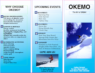
 On this brochure assignment, we chose to use Helvetica font for the "Okemo" on the front. We used Helvetica as the headline for all of our columns. For "The Art of Snow" and the address on the front of the brochure, we used
 The images that we used were of people snowboarding and skiing because we felt that this would best capture the essence of Okemo Mountain Resort. The map that we placed on the inside of the brochure is a little more blurry than we would have liked, but it had a very high resolution and we feel that it was readable.
On the background of each fold, we used a gradient involving light blue and white because we thought the colors remind people of winter. We added snowflakes as bullets because it gave the brochure a fun and winter-y feeling. We didn't want to use too many effects because we wanted the brochure to remain exciting yet simple so that it was easy to read and not too busy.
We found that Quark and InDesign are equally frustrating programs, but we really had a hard time with Quark. InDesign made it easier to manipulate the layers and work with images and text.

No comments:
Post a Comment