Thursday, May 14, 2009
Wednesday, May 6, 2009
Bind-in Blow-in cards
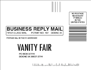
1. Photoshop-Back of Card
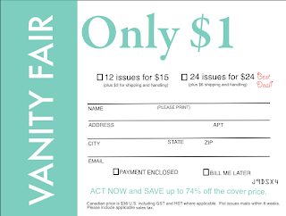
2. Quark-front
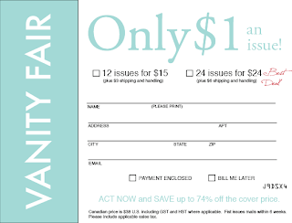
3. InDesign-front
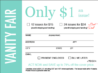
4. Photoshop-front
Design Rationale:
This project was the one that took me the longest to complete, because of its complex nature and attention to detail. I thought that finding the fonts to match each word was difficult for the first card; however, after I found them for the first one, it was easy to choose the same fonts in the other programs.
I found Quark to be rather difficult, because it is not easy to work with text in Quark. I had to create a new color in Quark because there were limited colors available and none of them matched the card. The color I created was C: 49.1%, M: 0%, Y: 31.1%, K: 0%.
InDesign was the program that I found to be the easiest to use. The use of colored layers helped me recognize what layer what text was on and how to manipulate it. The hardest thing to do in all of the programs was to create a box with no fill. Once I learned how to do it, I copied and pasted the box, so that they all would be the same size.
I chose to complete my first Bind in Blow in Photoshop. I found that completing the first card was the hardest part. One problem I encountered was the though the measurements matched up to the 4.3" x 5.625" card, the depiction on the screen was not to scale when held next to the actual card. I found that by viewing the project at 133%, the size matched up perfectly and made it easier to replicate the card.
I chose to replicate the back of the card in Photoshop because I understood how to manipulate the layers and text well in the program. The hardest thing to do was to create the little lines at the bottom of the card. I used the line tool, and realized afterward that it might have been a better idea to use the text tool and the letter "I" or "l" instead, because that way the lines are guaranteed to be straight.
One problem that I found was that not all the programs had the same font. When one program didn't have the font I had used in the previous program, I had to search through the fonts again. Another thing that I had to do in each program was create a new color. The color on the card was a hard one to duplicate, so it took some time to get it right. Still, the color on the 3 versions do not all match up.
If I had to use a program in a professional setting to complete a project of this nature, I would choose to use Photoshop because I feel that it has more options and more ways to manipulate and change material.
Monday, May 4, 2009
Monday, April 27, 2009
Newsletter
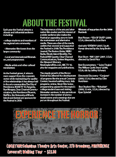
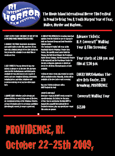
For this project we wanted to portray the scary nature of the event. To successfully accomplish this we first decided to make the background of the flyer black and the text white. This would not only create a dark, foreboding feel for the piece, but it would also help to set this particular flyer apart from the typical “black on white” flyers we see so commonly. Next we included several of the images provided to us by the teacher, as it is likely these images would be used on other event paraphernalia and it is important to keep common images, and text as a cohesive unit throughout the marketing campaign. The largest text on the front page (page without image banner at top) was reserved for what we felt were the most important aspects we were trying to convey to the viewer. Thusly the date of the event was the largest (68 pts), followed by ticket purchasing information (24 pts), and the event tagline (“The RIIHF is proud to…etc”) (24 pts), are the most prominent texts on the page. The remaining text is in 12 pt font. The text used is “cracked” and with its severed letters and a rigged look its intent is to convey a spooky feeling to the reader. The date of the event is also red with an orange outline, this allows the text to stand out more to the viewer.
On the reverse side a spooky banner image was used at the top to set the mood for what was going to come. The title text below is a font called PortagoITC TT. This font is a stencil font but with a twist. The sides of the letters are indented and slightly abnormal. This font look is typical of the cliché “army experiment gone horribly wrong” horror movie and is more than appropriate for this horror event. The majority of the text on the back is myriad pro. This was done to ensure readability for those who may not have the eyesight to have read the text on the front, as this is the case much of the important information is repeated. At the Bottom of the page we see a graveyard scene de-saturated in Photoshop, on top of which we see “experience the horror” in large text (PortagoITC TT) outlined in green. The location and price of the show are again repeated at the bottom to ensure the reader retains all the pertinent information.
Thursday, April 23, 2009
Brochure
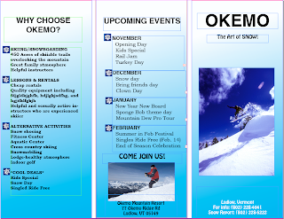 On this brochure assignment, we chose to use Helvetica font for the "Okemo" on the front. We used Helvetica as the headline for all of our columns. For "The Art of Snow" and the address on the front of the brochure, we used
 The images that we used were of people snowboarding and skiing because we felt that this would best capture the essence of Okemo Mountain Resort. The map that we placed on the inside of the brochure is a little more blurry than we would have liked, but it had a very high resolution and we feel that it was readable.
On the background of each fold, we used a gradient involving light blue and white because we thought the colors remind people of winter. We added snowflakes as bullets because it gave the brochure a fun and winter-y feeling. We didn't want to use too many effects because we wanted the brochure to remain exciting yet simple so that it was easy to read and not too busy.
We found that Quark and InDesign are equally frustrating programs, but we really had a hard time with Quark. InDesign made it easier to manipulate the layers and work with images and text.
Wednesday, April 1, 2009
Concert Poster
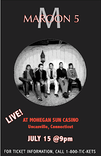
I chose to create a concert poster for the band Maroon 5, because they are one of my favorite bands.
Though I found Quark to be a rather temperamental program, once I found out how to work with the layers, I was able to successfully create my poster. I chose a color scheme of black red and white because those are three colors that are often associated with the band.
My favorite part of my poster is the "Maroon 5" overlapping the big grey "M". This is a symbol associated with the band, and I wanted to create it so that it looked similar to what is on most of their posters and album covers. To create the overlap effect, I had to place "M" and "Maroon 5" in separate layers. I then had to put them in the order that I wanted them to appear to the front. I sent the layer containing "M" to the back, so that the "Maroon 5" was in the foreground.
Another part about my poster that I really liked was the lettering that I used. For the "Maroon 5" I used Optima font at 80 pt, and for the "M" behind it I used "Candara" font at 250 pt. To make the white letters with a red outline, I clicked the "Outline" tool in the text toolbar, then created a red that I liked with the color selection tool. For all other text on the poster, I used "Abadi MT Condensed Light" at different sizes. For emphasis on the location of the concert, I chose to make the lettering bold and a solid red color.
The image I chose to use was an image of all 5 band members. The image was black and white to begin with, which I found particularly cool. I used Photoshop to edit the photo. I gave the photo Poster Images from the Effects gallery, which made it seem as though the band members were radiating light. When I inserted the picture onto my poster in Quark, I chose the oval picture frame, because I thought it made the poster look really cool.
One thing that I found difficult with Quark was spacing. I found that under the "View" menu, I can select to view my poster with guides, and I can create my own spacing guides by clicking on the ruler at the left and dragging it to wherever I want my guide to be. I used the ruler to my advantage and used it to find the center of my drawing and space my words and images accordingly.
Another thing about Quark that was mildly frustrating was figuring out how to move items to different levels. Once they were on a level, it was hard to move them to another one. I also found it hard to create and use colors other than the 5 that are provided. I had to create my own shade of red to use because there was no red option in the main colors offered.
Overall, I am glad that I have worked with Quark, but I feel that there are still many parts of it that I need to become familiar with. I hope to become better acquainted with the program during our next project.
Wednesday, March 11, 2009
Power Point
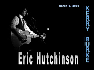
Eric Hutchinson incorporates a funky yet smooth flavor into his music, and I tried to embody this in my Power Point through my font, image, and sound choice. This Power Point project was a very challenging project, and there were many times when I wanted to throw the Mac out the window, but overall I learned to do a lot of new things that I didn't think I would be able to do and now I can use these tools in the future.
Tahoma was my font of choice on this Power Point because it is easy to read, and I didn't want to use anything too fancy. I didn't change the font from slide to slide because it is often discouraged, and I thought it would be confusing to the audience.
The images I used in my presentation were images of Eric Hutchinson performing. He is a great performer and songwriter, and I wanted to show that through the images. I wanted the pictures to be simple, but display his musical talent at the same time. I used my favorite image on Slide 1. It was black and white, which I thought was cool, and had a resolution of 240. I used the "dissolve" entry effect and started the slide show with it.
On the image text slide where I listed the tracks of one CD, I added the album cover in the center of the slide with the diamond entry tool. Around the album cover, I inserted the names of the tracks on the album and their times in a pattern that made the slide resemble a sun. I wanted to make the slide fun and different. On the track names that were slanted, I used the "Pin Wheel" effect, and on the track names that were horizontal, I used the "Grow and Turn" effect.
The final image I used on Slide 5 was another image of Hutchinson performing. This image was in color, however, and facing the opposite direction of the first one, which I thought was kind of cool.
I now consider Audacity to be a pretty cool program with a lot of capabilities, but I did not feel this way at first. When I first started playing around with my music, I was afraid that I would cut the wrong music, and was not exactly sure which files to save, or how to import and export correctly. I was kind of music-editing illiterate.
At first, when I imported the music I had edited in Audacity, I couldn't figure out how to make the music play beyond the first slide, but I found that I needed to go to the formatting pallet and select "Play across slides" for it to play continuously.
Through playing around with both Audacity and Power Point, and taking suggestions from fellow students, I figured out how to do some pretty cool things, like fade sound in and fade out, and use multiple songs in one presentation.
The songs that I chose to use were Eric Hutchinson's "Rock & Roll" and "All Over Now". I timed the slide show so that the presentation ended with the lyrics "It's all over now". I thought it was cool that the line was the last thing the audience heard at the end of the show. I faded each song in and out so it didn't come in too abruptly, and the slide show flowed nicely.
My chart is pretty basic. I chose to compare my artist to 3 other artists that share similar styles of music. I compared Eric Hutchinson to Jack Johnson, Ben Harper, and Jason Mraz and their age, home state, most recent album title, and their typical genre. I could have given the slide a little more color and fun effects, but I didn't think it was necessary because I wanted the audience to focus on the table and its contents. I did, however, use a cool "Circle" entry effect for the table itself.
At the end of this project, I feel confident in the fact that I can create a Power Point with sound and have it run on its own. Working with the slide transitions so that they were in sync with the music posed as a challenge, but once it worked, it was really cool to watch. I am actually very proud of my Power Point, and I can take away some great skills from this project.
Subscribe to:
Posts (Atom)
